Strategy + Design
Jardín Botánico de Medellín
This project was developed as my Final Project for my Master's in Graphic Design. The assignment was an open brief: to redesign the identity of any brand. I chose Jardín Botánico de Medellín as it represents both a symbolic and emotional landmark, the city where I was born and raised: Medellín.
Objective
The main goal was to create a cohesive and meaningful brand system that could express the true essence of the garden — its story, purpose, and emotional connection with the community. The existing identity lacked consistency and operated more as a standalone logo than a complete brand.
Research
The research phase included:
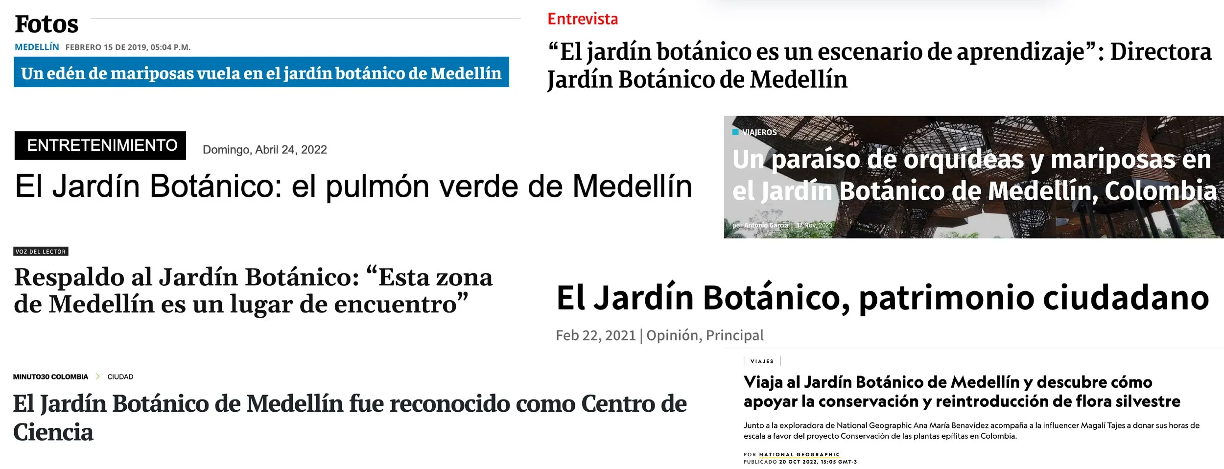
Visual and strategic analysis of the existing identity.
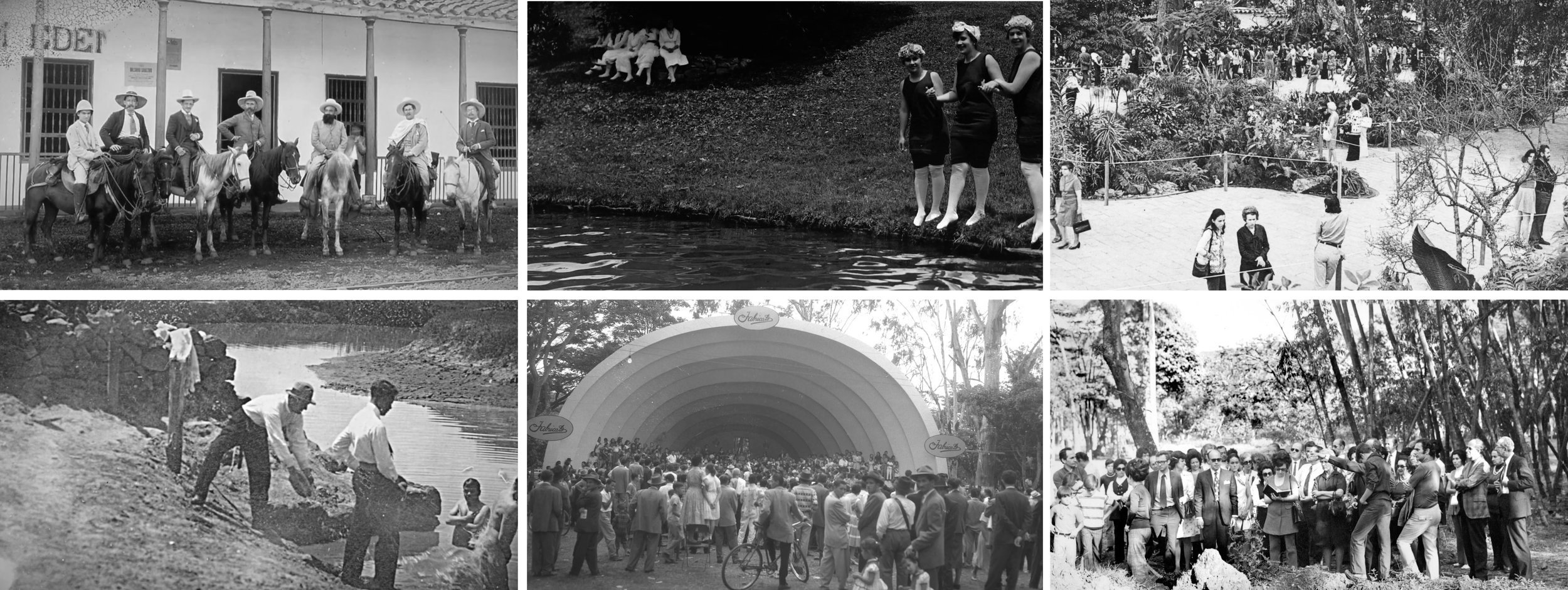
Study of the garden’s history, current cultural and ecological role.
Personal observation and emotional connection as a citizen.
Benchmarking botanical gardens around the world.
Audience segmentation and exploration of public programming.
Key insights:
The garden as a community gathering space
A place of healing and connection with nature
A living museum: education, science, and biodiversity
A paradise in the city: calm, refuge, life
A green lung: alive and breathing
A civic landmark with deep emotional and symbolic value
Concept
“A living museum born from the code of nature.”
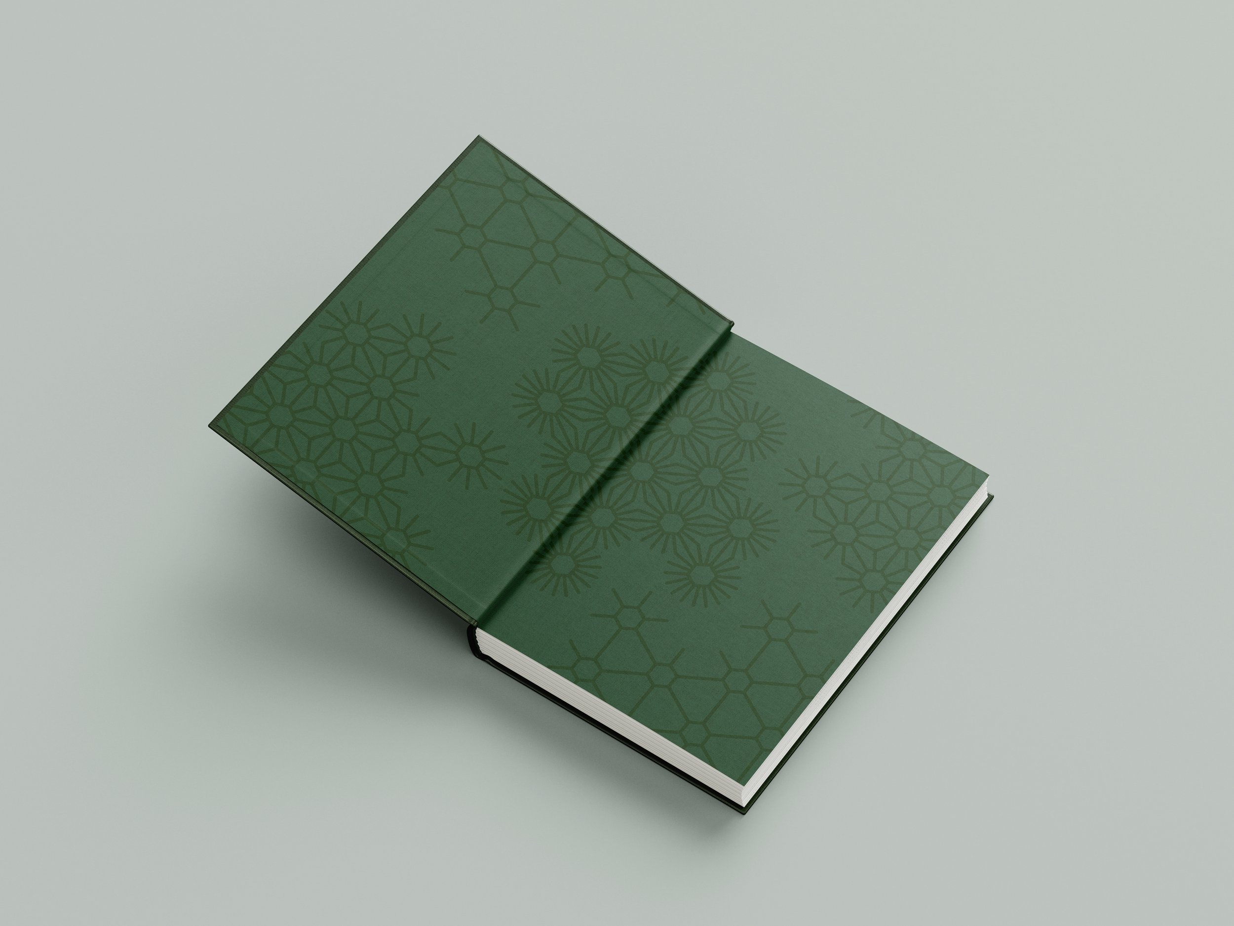
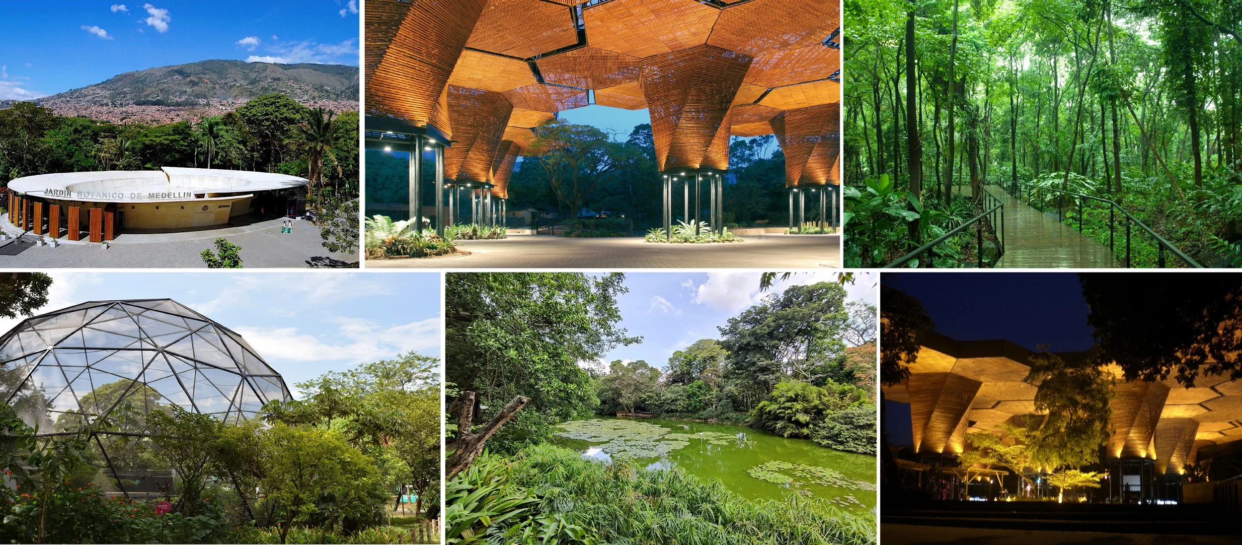
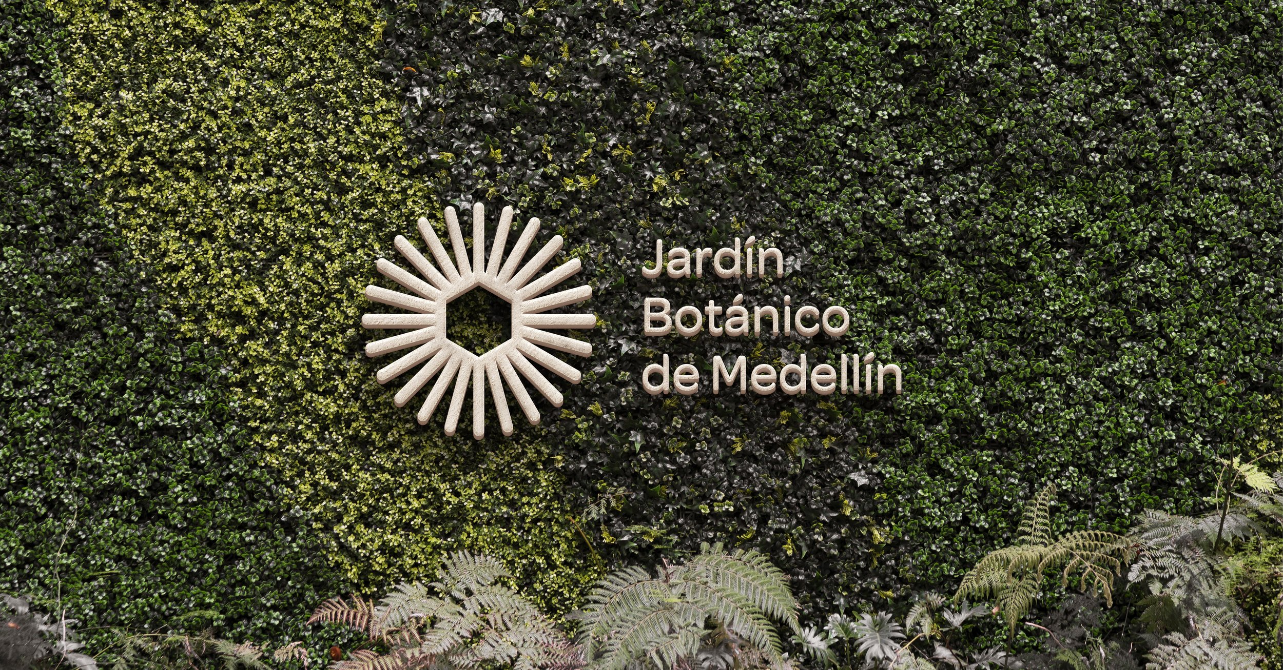
The concept is rooted in the hexagon, inspired by the Orquideorama’s architecture and a unique language of nature, where the hexagon is present in the various systems in nature. This shape becomes the core structure of the new identity — a visual code that expands, transforms, and connects.
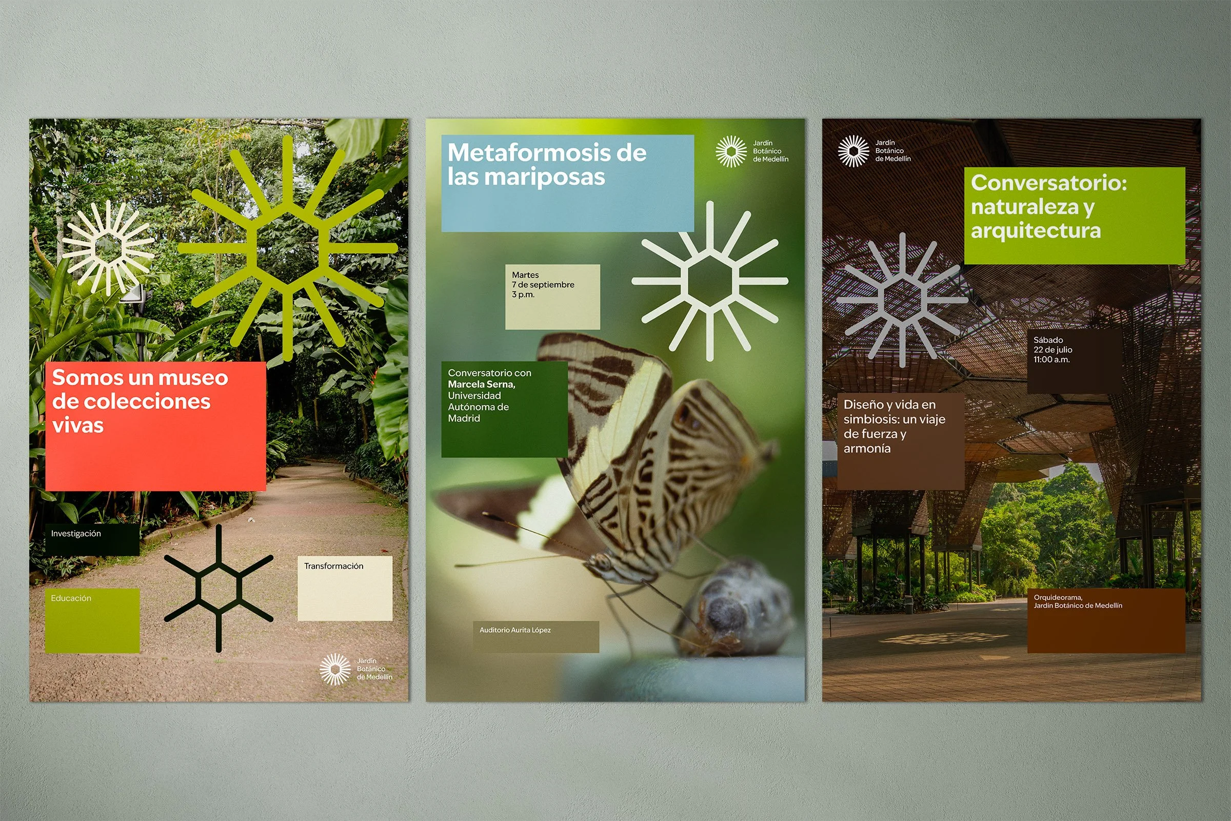
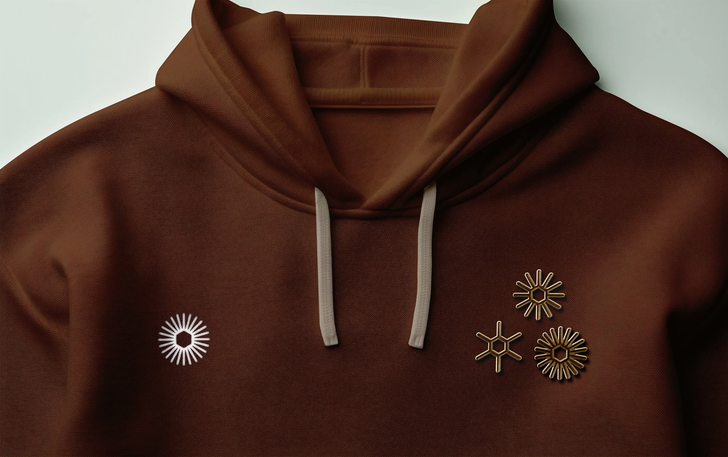
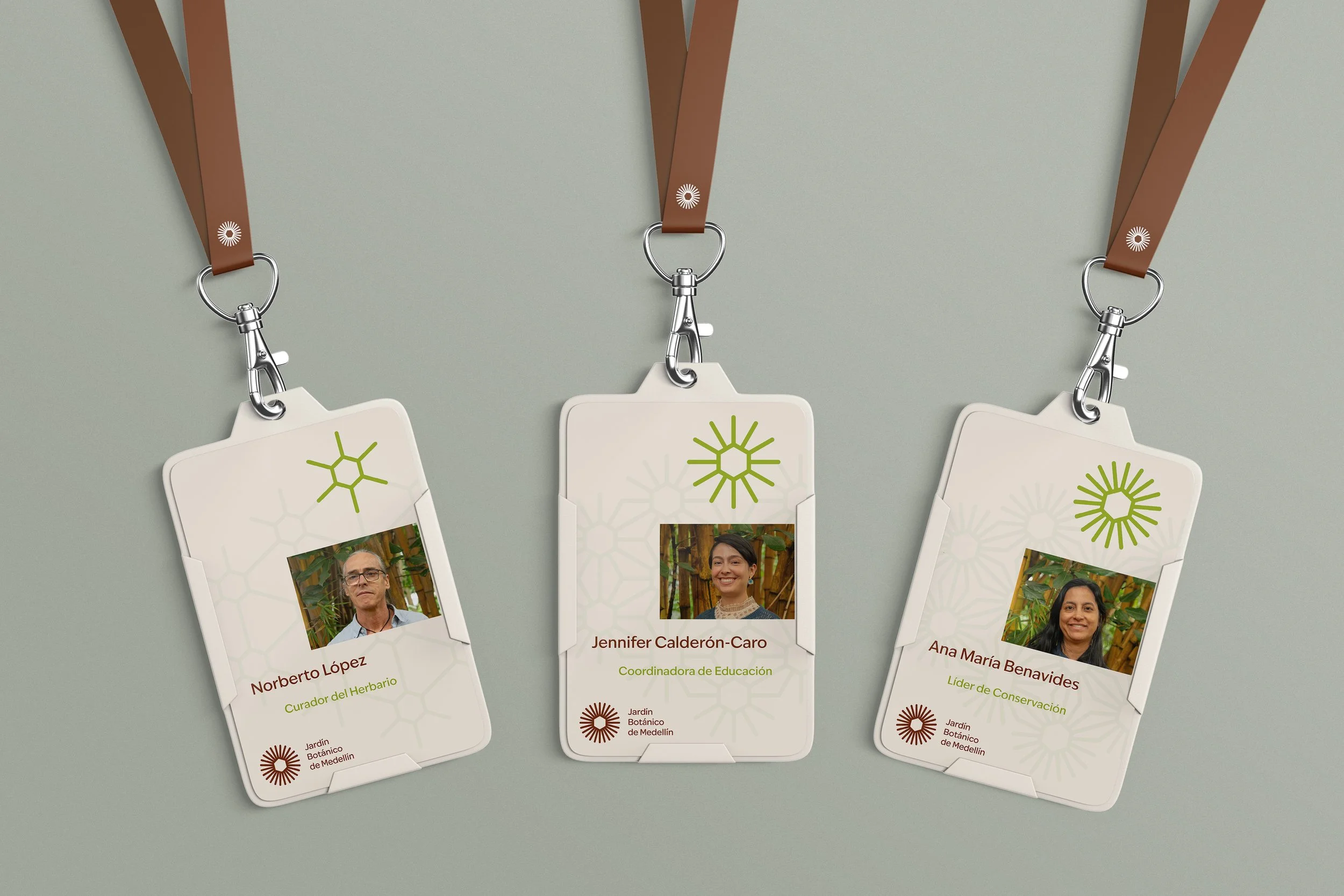
Logo System
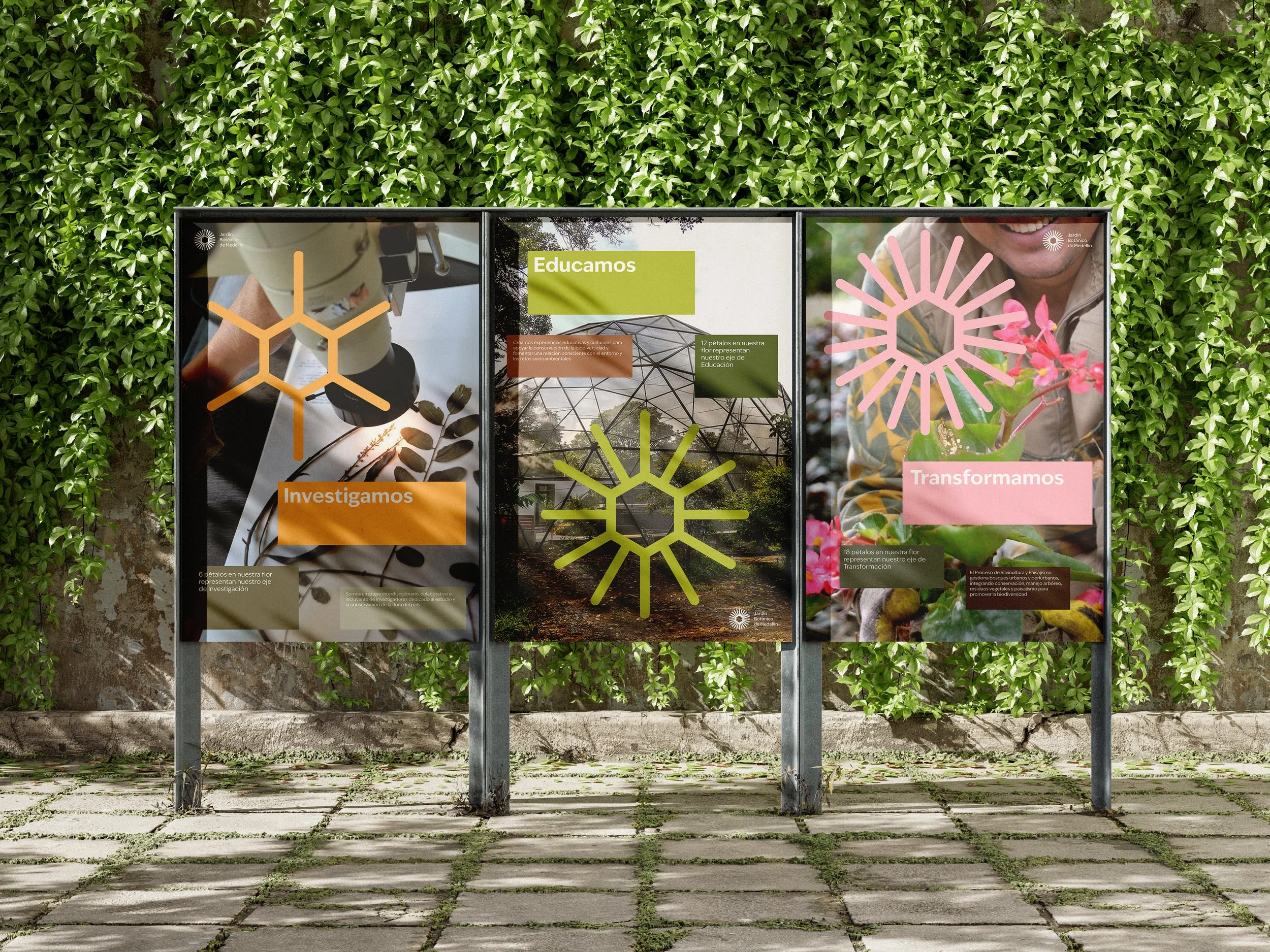
The main logo is based on the hexagon. From this form, a flower made of 24 petals emerges, representing the garden as a living system.
The resulting symbol symbolizes:
A flower: growth and biodiversity
The sun: energy and life
A community in union: petals joining at a central point
Sub-identities
In its transformation, each petal count connects to a core pillar and program of the Jardín Botánico:
6 petals: Research
12 petals: Education
18 petals: Transformation
The symbol is both a logo and the base for a flexible brand system. From this same structure, sub-identities were created for each pillar, allowing consistency while addressing different audiences and programs. Each new identity grows into a pattern that responds to its symbol.
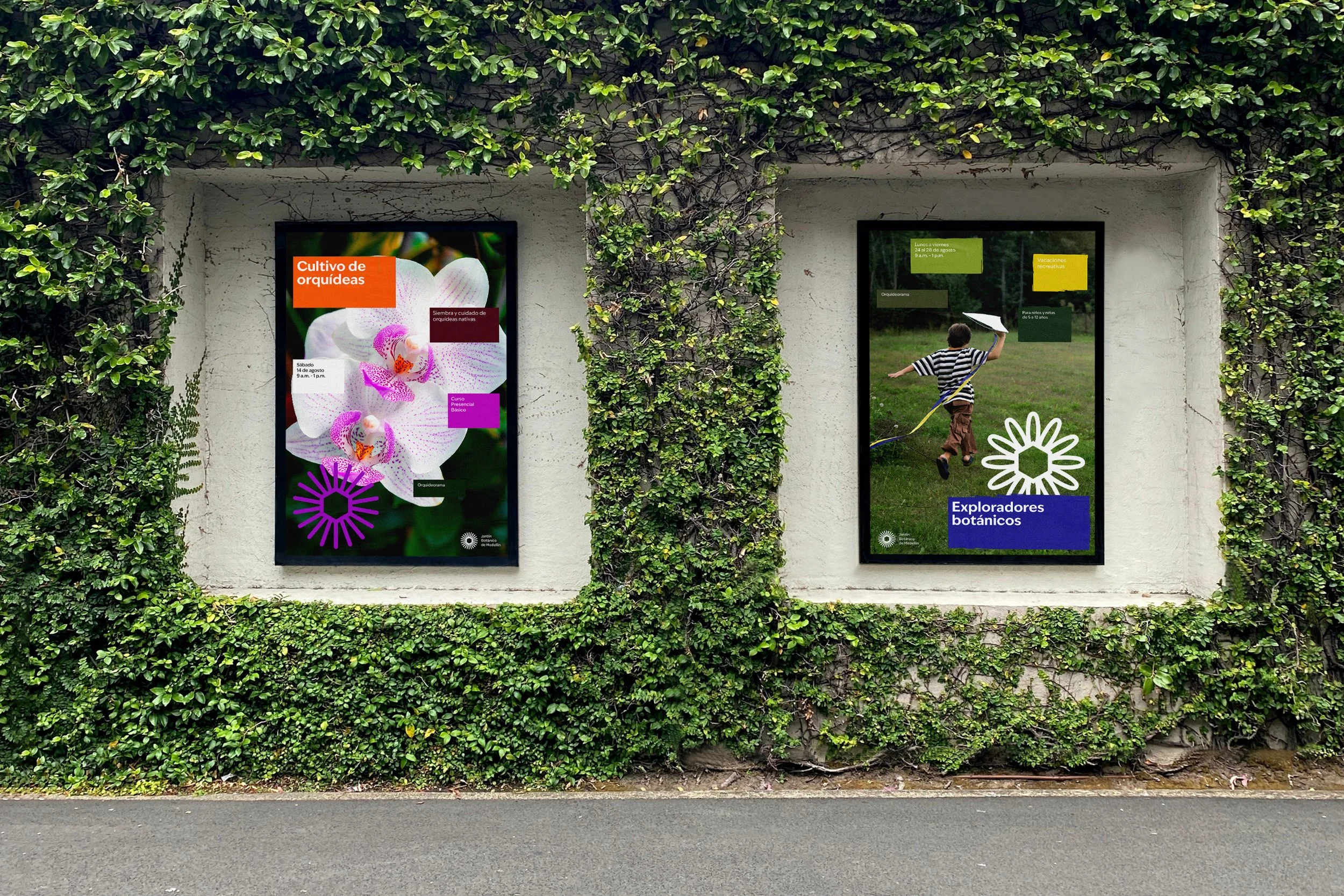
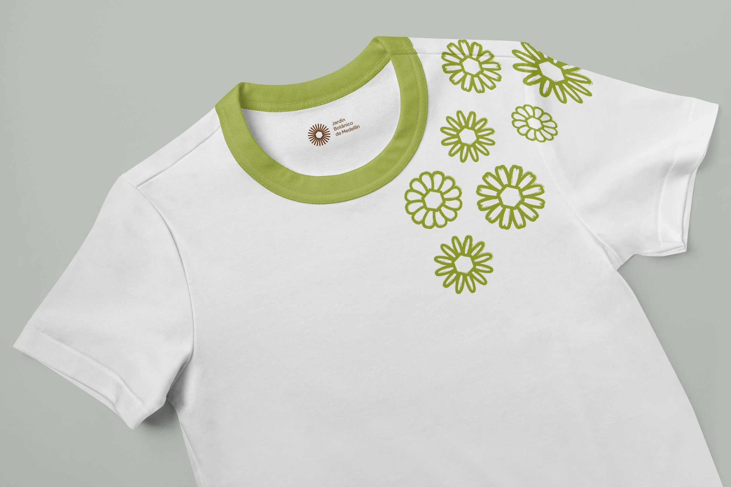
Children’s Identity
A separate sub-brand was developed for the children’s audience, preserving consistency while adapting tone, color, and shapes to be more playful and engaging.
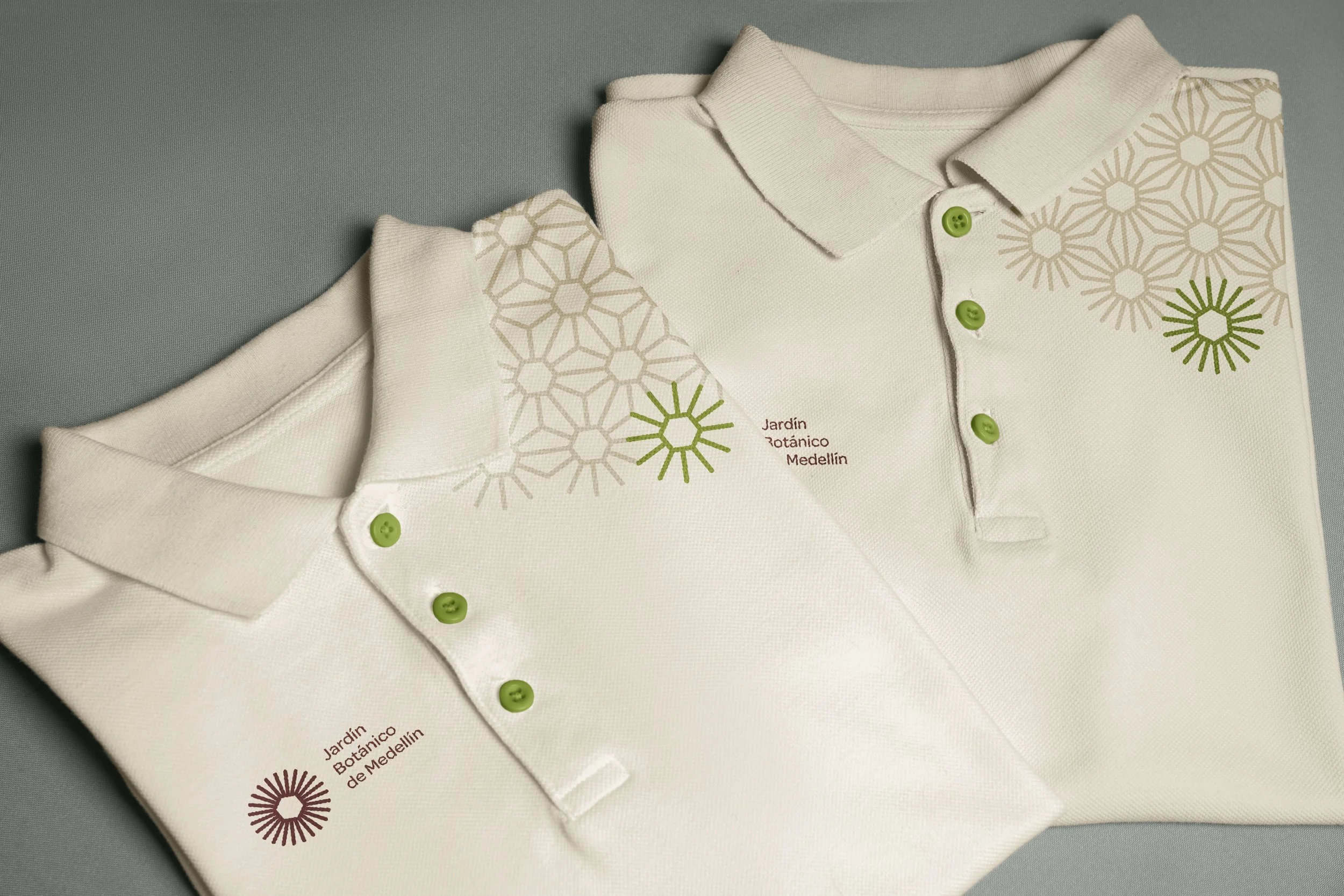
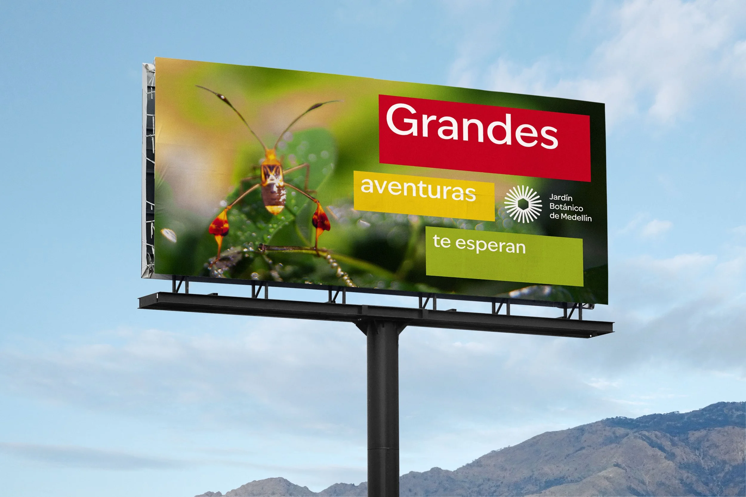
Visual System
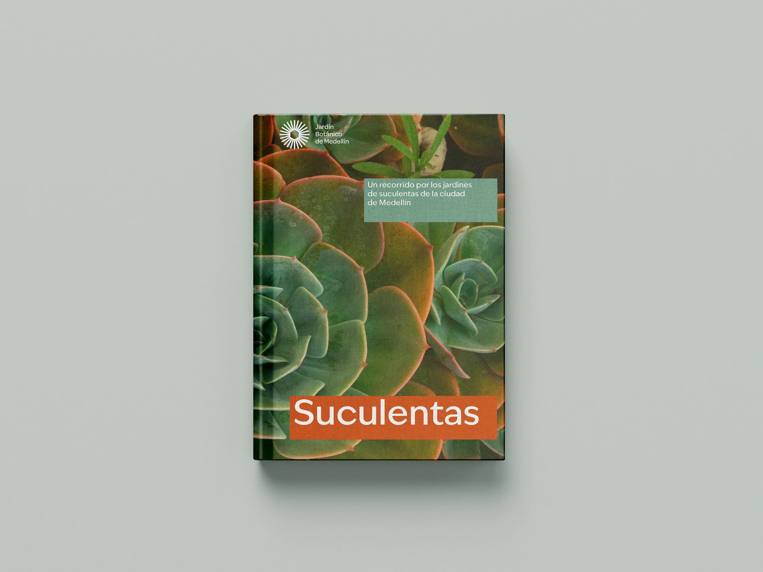
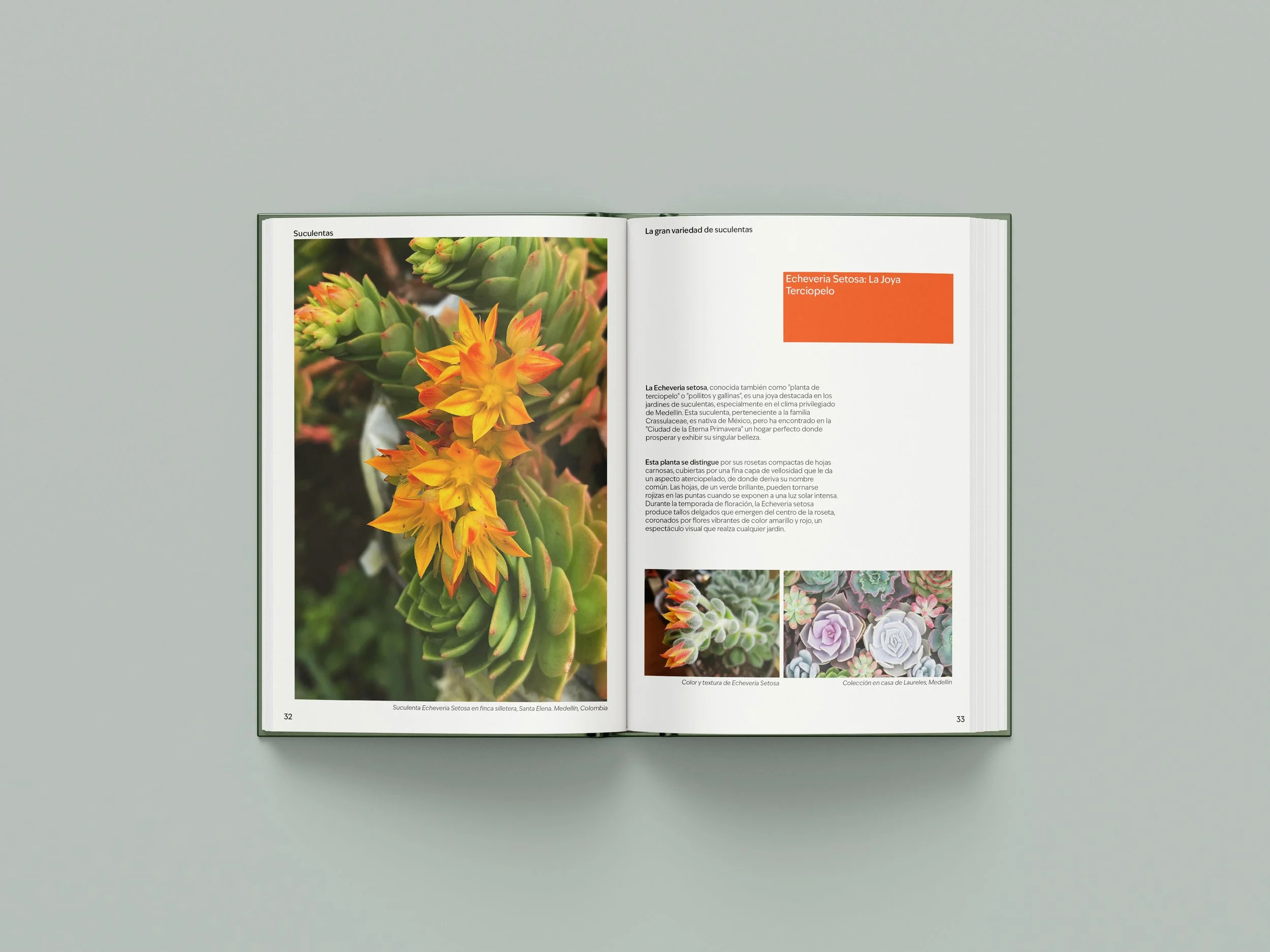
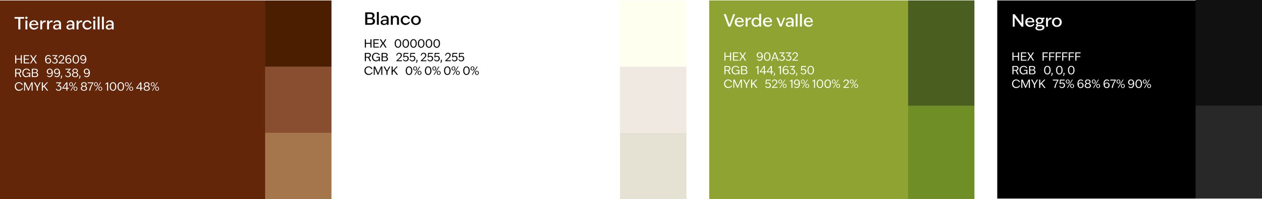
Color Palette
Core Palette:
Clay Earth: speaks of roots, grounding, and growth
Valley Green: a nod to the Aburrá Valley, Medellín’s flora and natural textures
Black and White: provide structure and contrast, allowing the earthy tones to shine
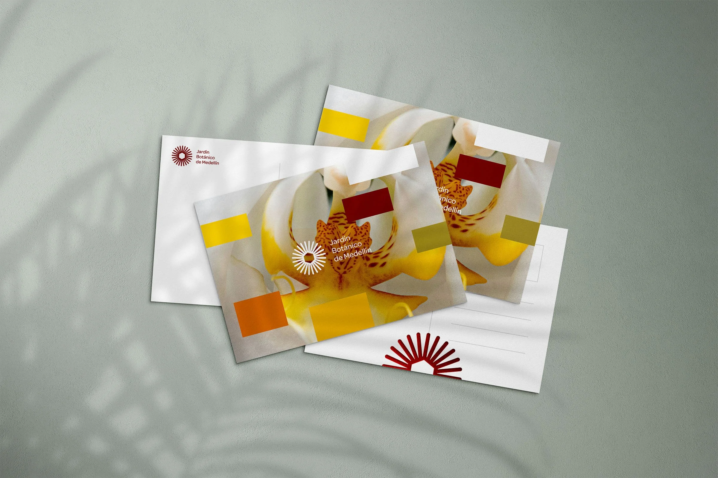
Extended Palette — “It’s Alive”
An evolving, nature-inspired color system. It reacts to photographic imagery, drawing tones from the fauna and flora to create an infinite, adaptable palette — embodying the concept of a brand that is alive, organic, and ever-changing.
Typography
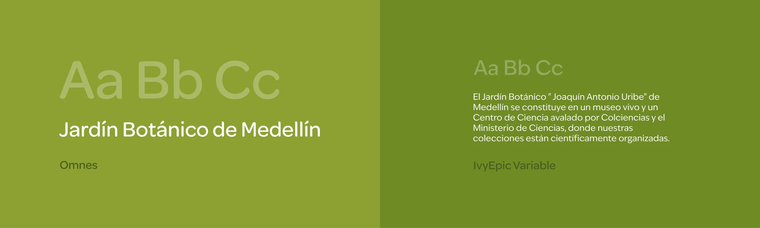
Logo font: Omnes — soft, rounded, modern with a friendly personality
Text font: IvyEpic Variable — complements Omnes with flexibility and structural balance
A typographic scale was developed using +12pt increments, with optional intermediate jumps of +6pt to establish fluid information hierarchies.
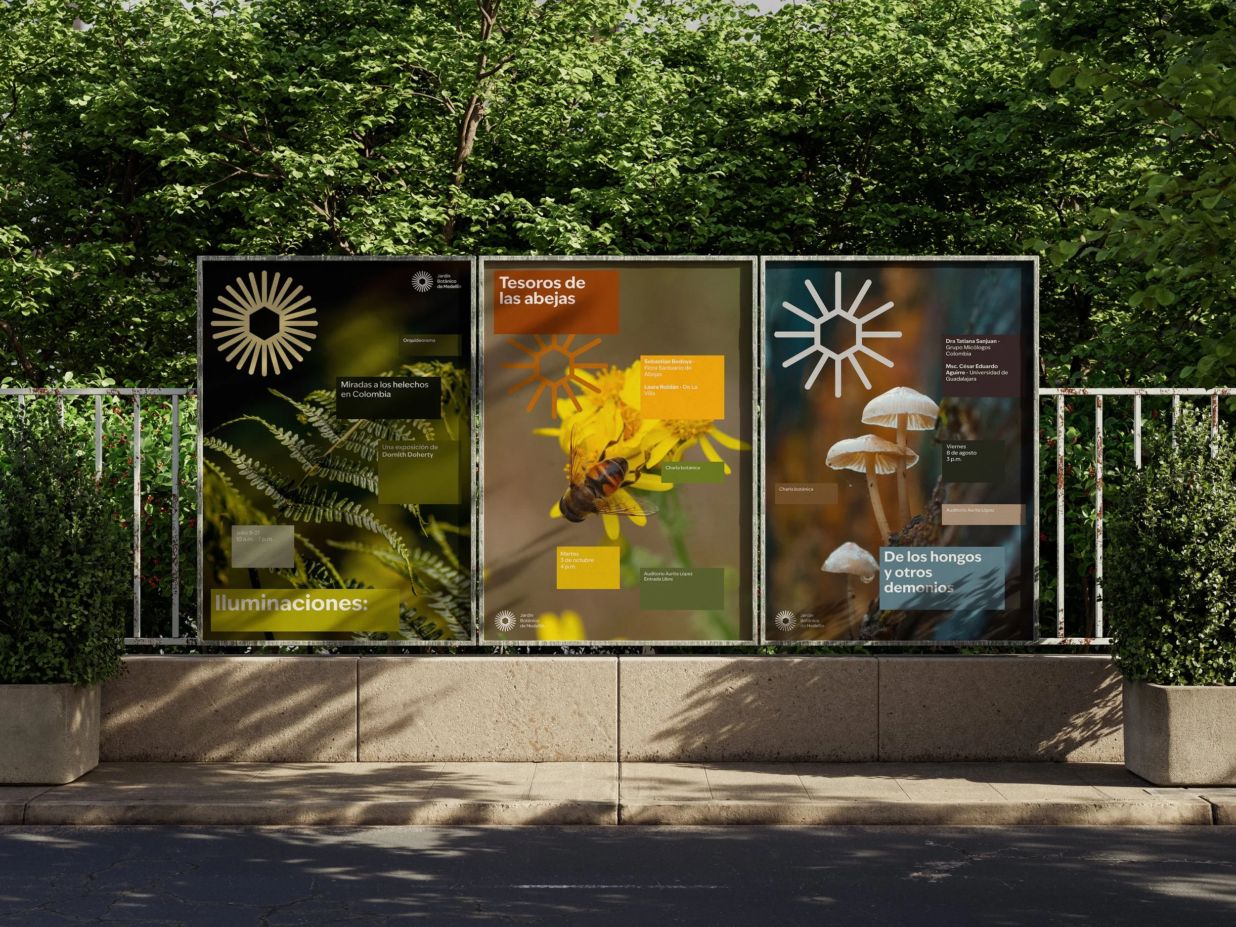
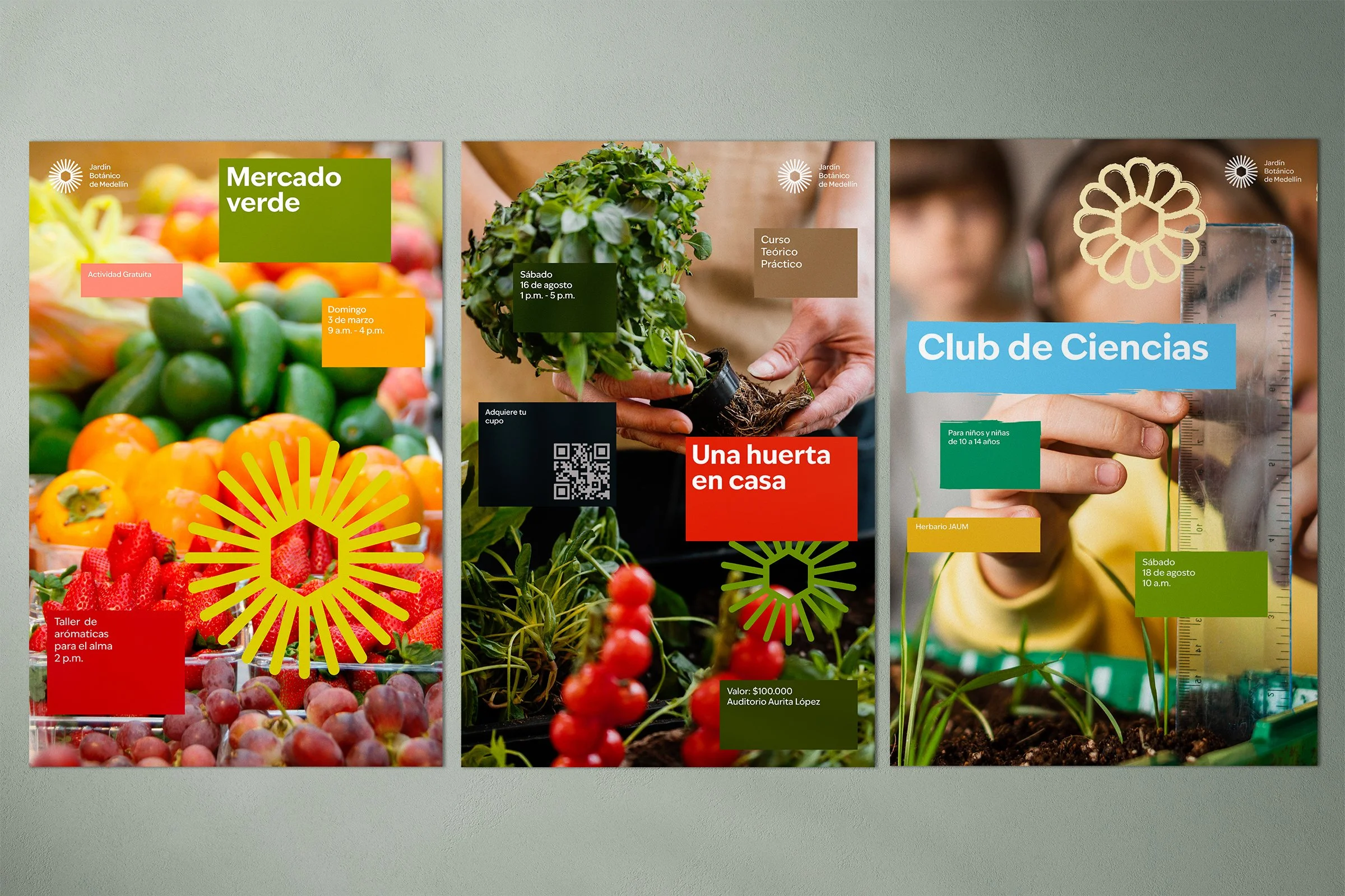
Grid System
A modular 1x1 square grid allows free composition, movement, and flexible alignment across formats. Symbol variants integrate into layouts to highlight thematic areas and events. The system adapts to both horizontal and vertical designs.

A Living Brand System
This rebranding project proposes a symbolic and modular identity system that expands from a single geometric shape: the hexagon, into a dynamic visual language. The identity breathes, transforms, and responds, like nature itself.
The goal was to build a living brand: one that adapts across formats, audiences, and uses, while preserving coherence and emotional connection.
It positions the Jardín Botánico de Medellín not just as a place, but as a living museum — a space that teaches, heals, connects, and grows. A landmark that now has a visual identity capable of expressing everything it holds: nature, community, and transformation.